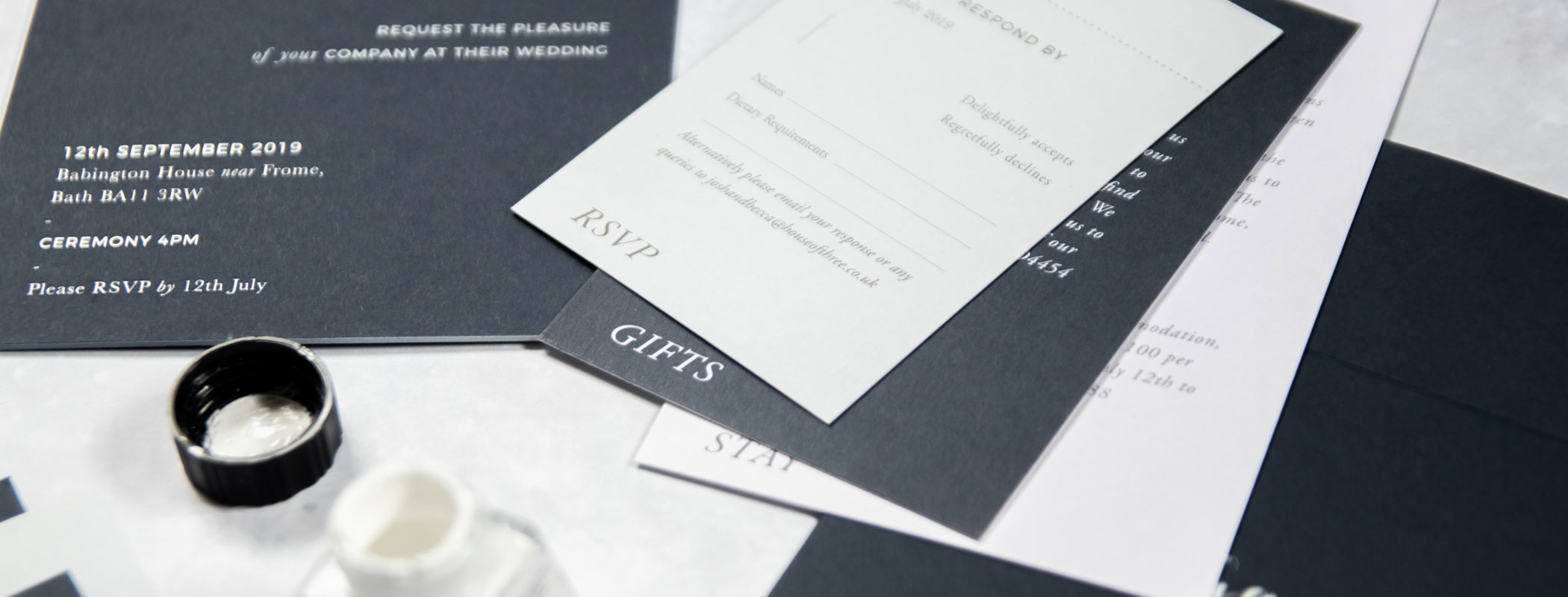
My Wedding Stationery Design from Paperknots
I promised myself that I wouldn’t let this post just simply be a shrine to Lisa at Paperknots. But we all know that’s basically what it’s going to be! Even if you’ve already selected who will be making your wedding stationery, I will go through my story from start to finish. So it’s definitely still worth a read.
Wedding Stationery Design is a touchy subject. In the world of tech, websites and spending over 4 hours a day on our phones, I can understand why some people want to go digital. But I feel like we spend so much of our lives on technology. So surely getting married gives us an excuse to fall in love with paper again. Well it did for me anyway. So I thought I’d go through my wedding stationery designs with you, from start to finish.
Luckily for me, I already knew exactly who I wanted to make my wedding stationery. I’d been following Lisa on her Instagram account @paperknots for absolutely years. And had always wanted a reason to work with her.
I'd been following Lisa from Paperknots on Instagram for a long time. And really had just been waiting for an excuse to work with her!
I had two wedding supplier non-negociables. Benjamin Wheeler would be our photographer and Lisa at Paperknots would be making our wedding stationery. Although I did have to pretty much beg as she was going on maternity leave!
You can’t really do much until you’ve booked your wedding venue. I’d actually also spoken to Lisa as soon as we’d got engaged. And had unofficially booked her in for the work before we’d booked our venue. We met at Chiswick Fire Station for the first time, and she went though all of her designs and what she might be able to do for me. We were going for her totally bespoke service so that she could get as creative as possible.
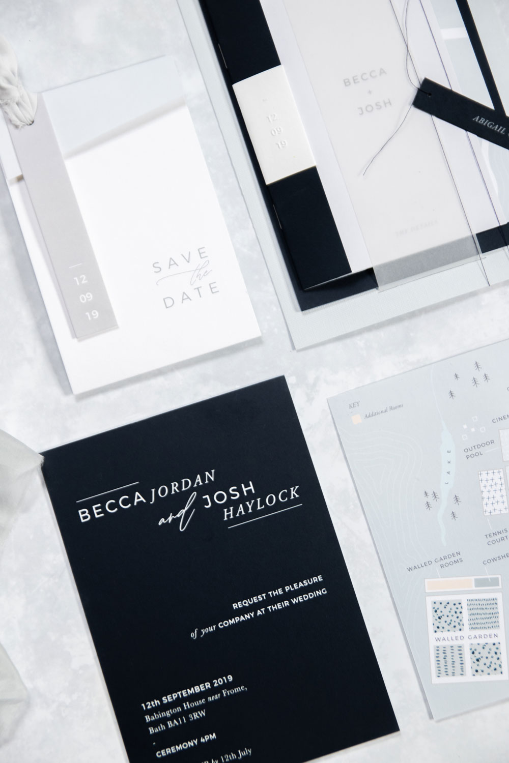
And that’s where our wedding stationery design began. Babington House weddings are always on a Thursday, with all guests staying overnight and enjoying a breakfast on the Friday. It’s also quite common for the bridal party to arrive on the Wednesday for a pre-dinner. And with so much information already, and days off work required, a Save the Date was an absolute must.
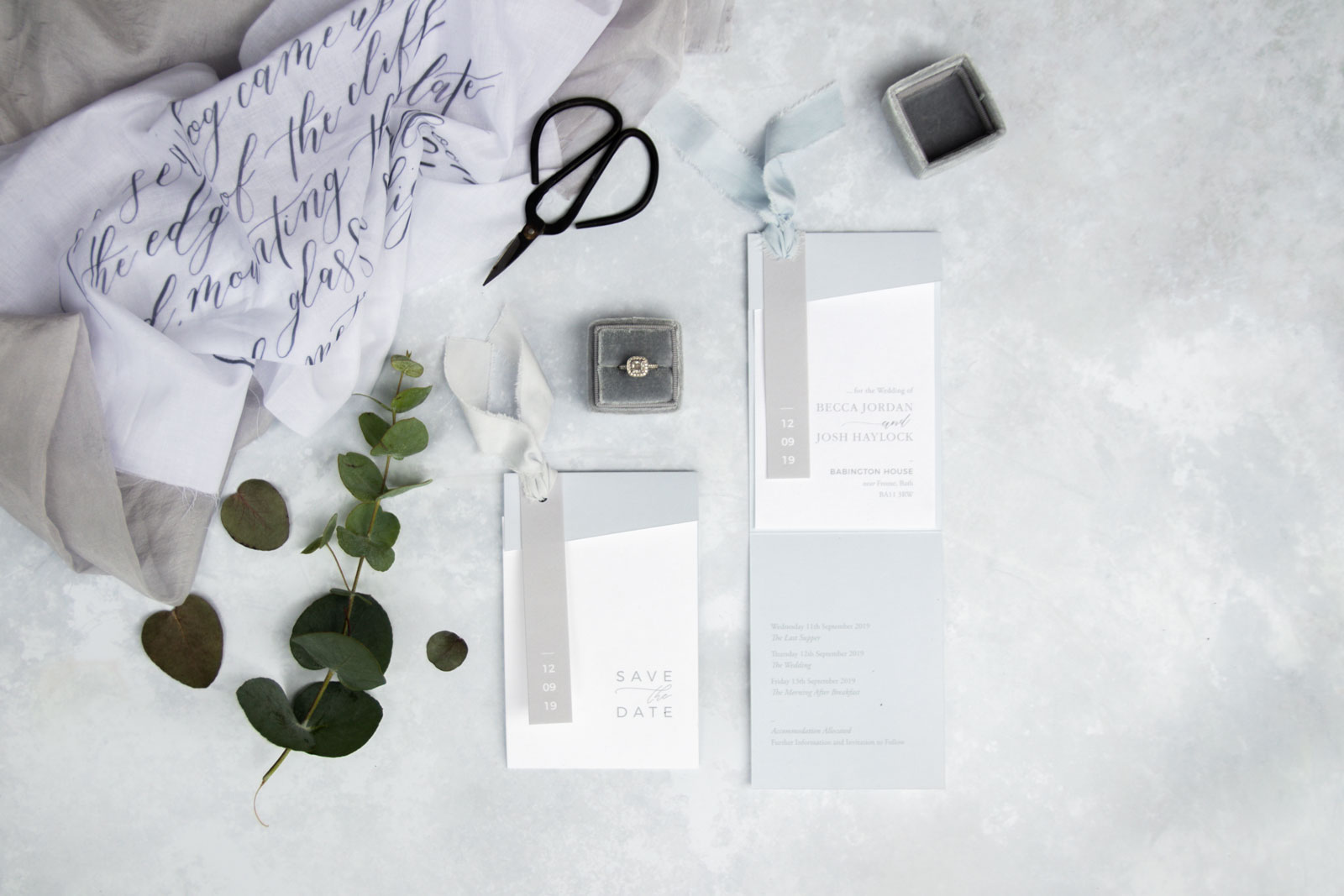
Wedding Stationery Design – Save the Dates
Following our first meeting, Lisa went away and with her team started designing a few options for Save the Dates. I’d sent Lisa a Pinterest Board and also a document with my ideas and what I’d like to include throughout our wedding stationery design. I couldn’t decide if I wanted something rustic or something really clean.
Although I’m in the weddings world, and I’m also into design, having a specialist wedding stationer was absolutely vital for me. Even though I didn’t know exactly what I wanted, I did know I wanted it to be super creative. And Lisa was absolutely perfect for this, as she’s just so talented.
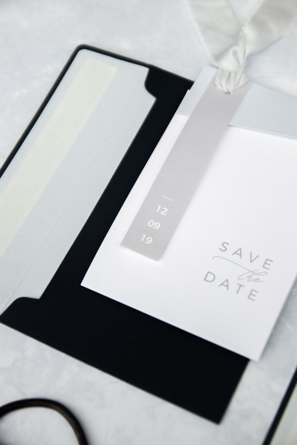
The first design concept for our Save the Dates is what we went with. Seeing them come to life was just incredible. Our wedding date, written down on paper, finally meant it was ‘real’. The date was there, happening and sending out the save the dates made it so much more exciting.
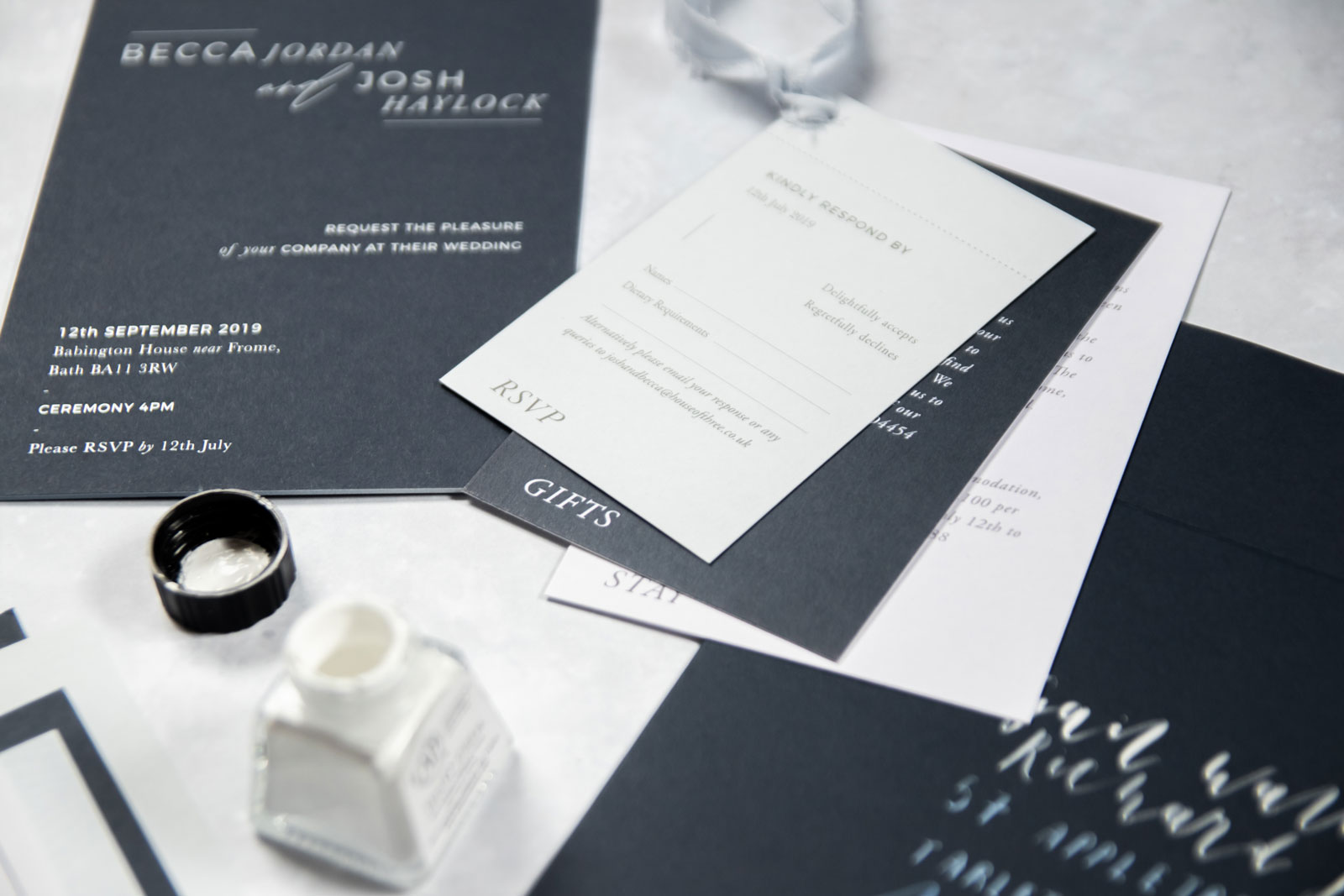
We posted out our invitations four months before the wedding, and requested the RSVPs two months before the wedding.
We posted our Save the Dates on the 9th November 2018, just over 10 months before our wedding day. And I spent about 10 minutes at the post office asking for anything other than first class red stamps! We ended up posting them using second class blue stamps so that the stamp worked with the colour scheme too.
The Invitations
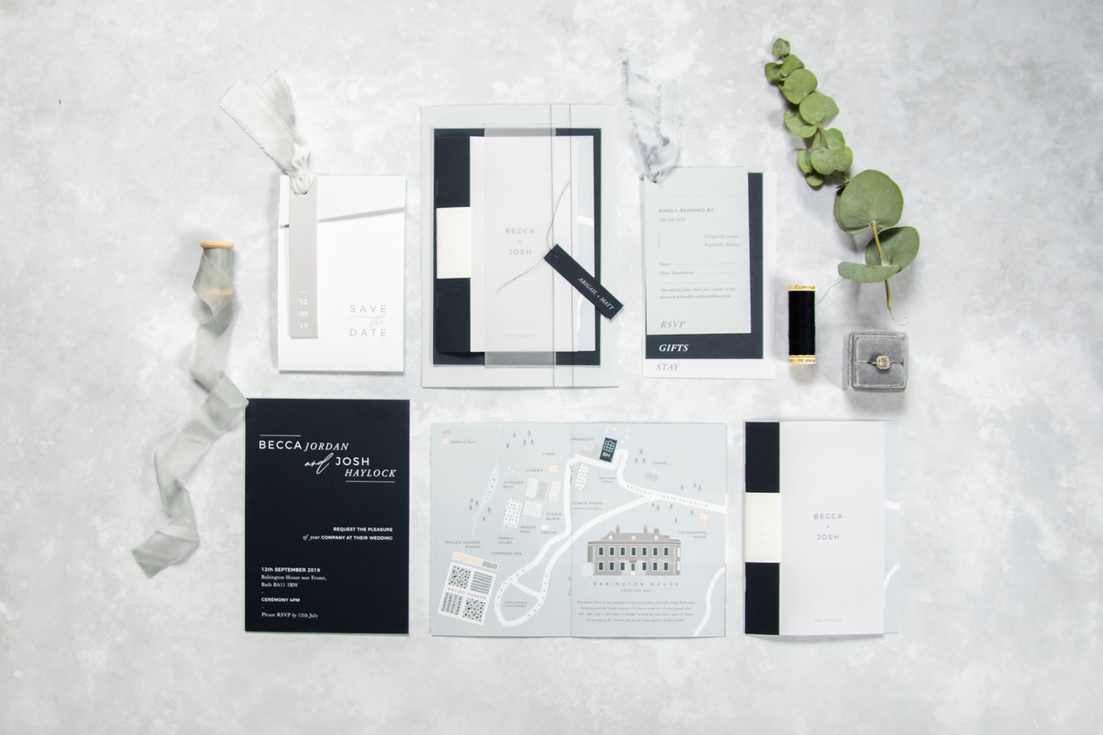
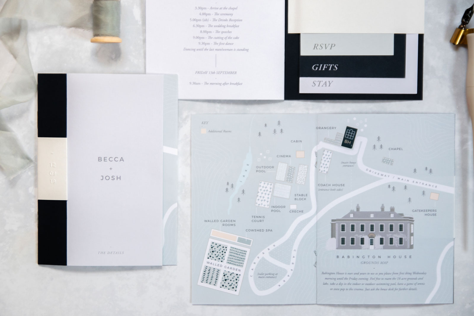
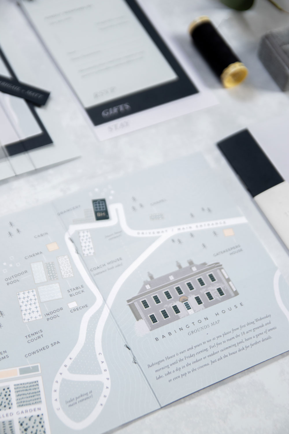
We moved straight onto the invitation design as soon as the Save the Dates were sent. Just like the Save the Dates, we had so much information we wanted to include. I also really wanted to include a hand drawn map – and so again Lisa got to creating our wedding stationery design.
When posted on Instagram for the first time, another Babington Bride asked if she could have the same one. It was so lovely to know other people were already wanting to use our stationery. Our map was the first page of our details booklet. And the booklet included the Order of the Day (details of what time to arrive), RSVP Card, Gifts Card and the information on Accommodation.
Include details like dress code, when the food is etc.
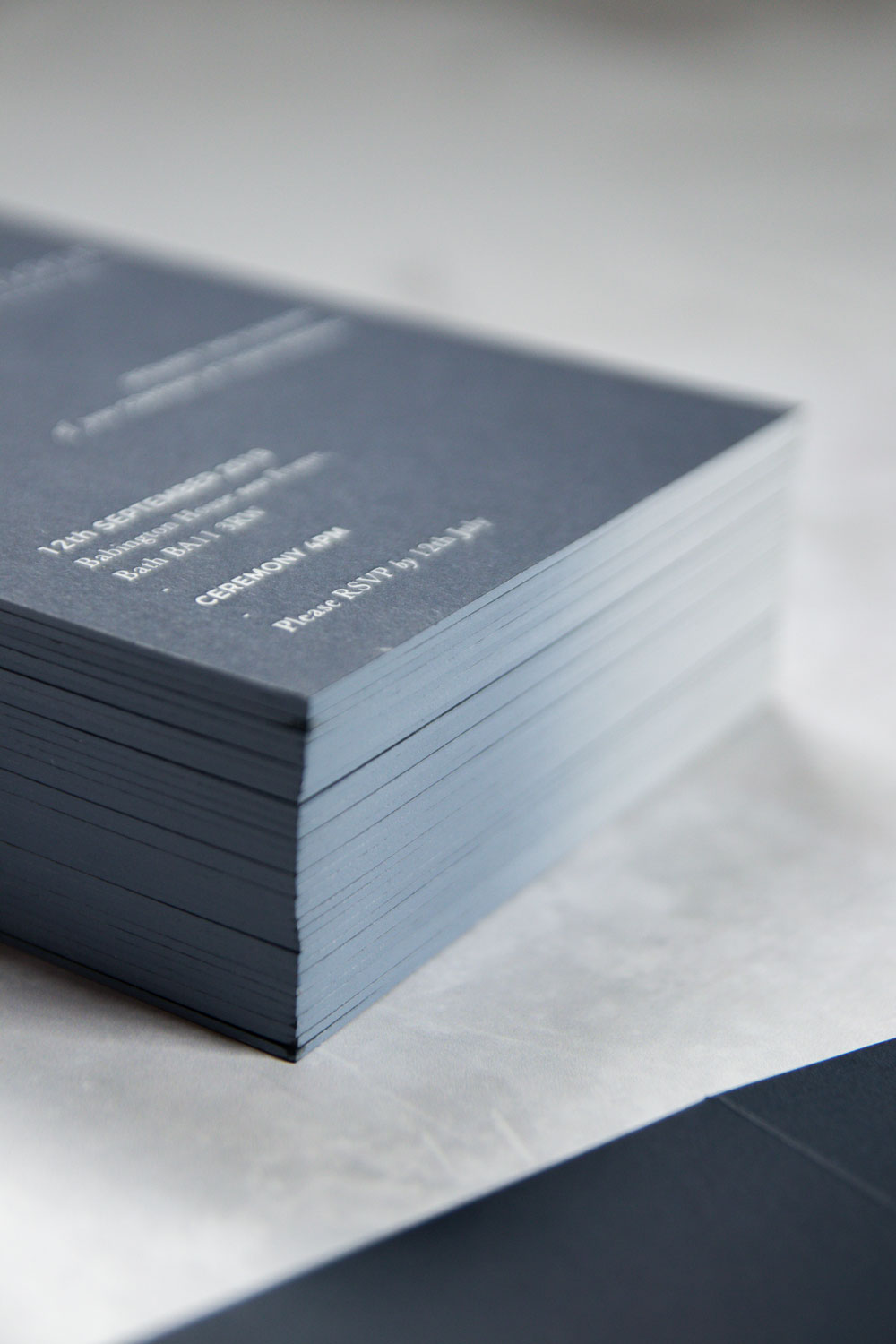
Alongside the Information Booklet, we had our actual invitation. Which I think was quite possibly the most beautiful piece of card I’ve ever held! It was so thick and luxurious. And had white hot foil text and an ombre painted edge. The edge was absolutely amazing, although I’m not entirely sure anyone actually noticed it. But both Lisa and I knew it was there!
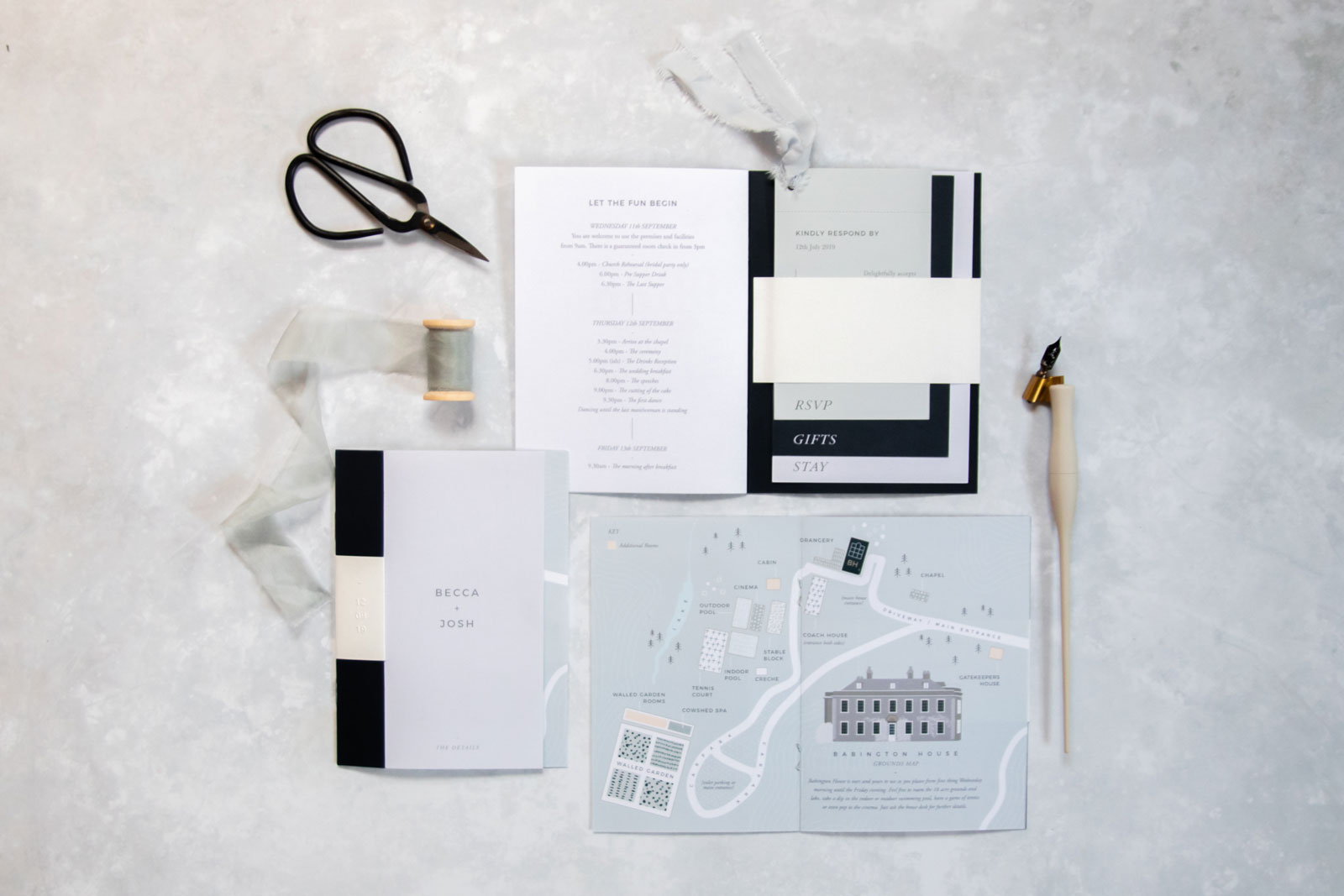
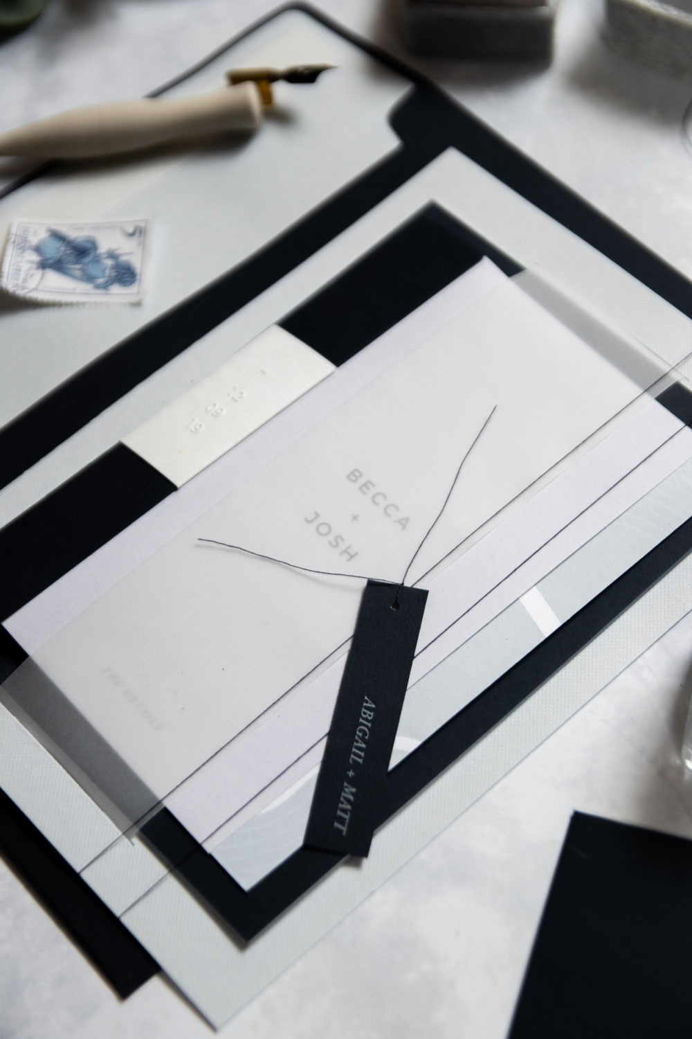
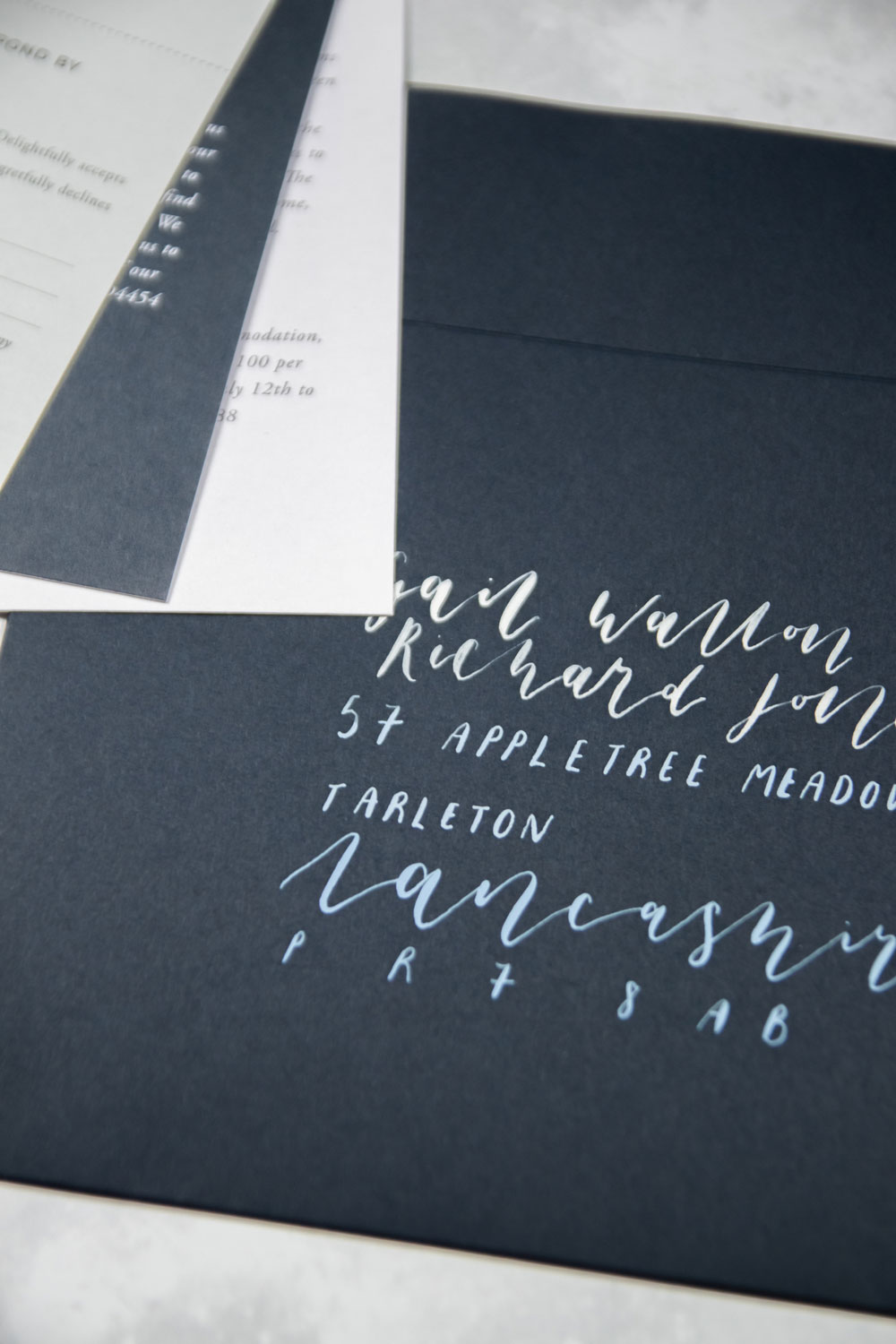
To put the invitation and booklet together, we used a backboard, vellum band and tied them with string and a tag including the guests names. We posted our Invitations on 17th May 2019 and requested the RSVP by 12th July – 2 months prior to the wedding day. One of my favourite additional details of our stationery, is that we also had ombre calligraphy on the envelopes too!
Save the Dates posted, Invitations posted, it was time to move onto our day stationery. On the Day Stationery is so important. But make sure you include a budget for it right at the beginning. Because you don’t design it until much closer to the day, lots of the time you end up with no budget left.
We actually almost spent the same amount of money on our On the Day Stationery as we did on our Invitations. So whatever you want to spend on Invites, double it so that you know you have enough to go around! For the Day we had the Order of Service, Table Plan and Note Cards, Menu and Place Names, a Welcome Sign and a tag for the Welsh Cakes.
On the Day Stationery is almost as expensive as your Invitations. So I'd suggest doubling your budget. Or halving it! And spending half on one, half on the other.
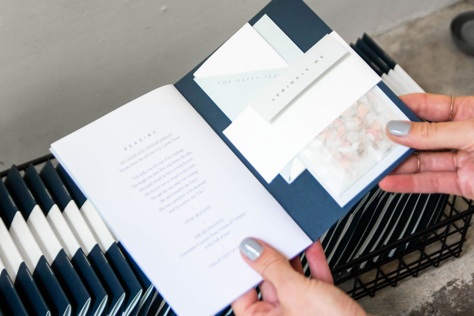
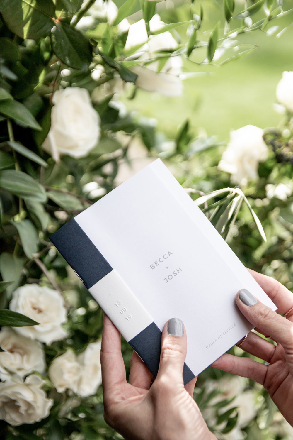
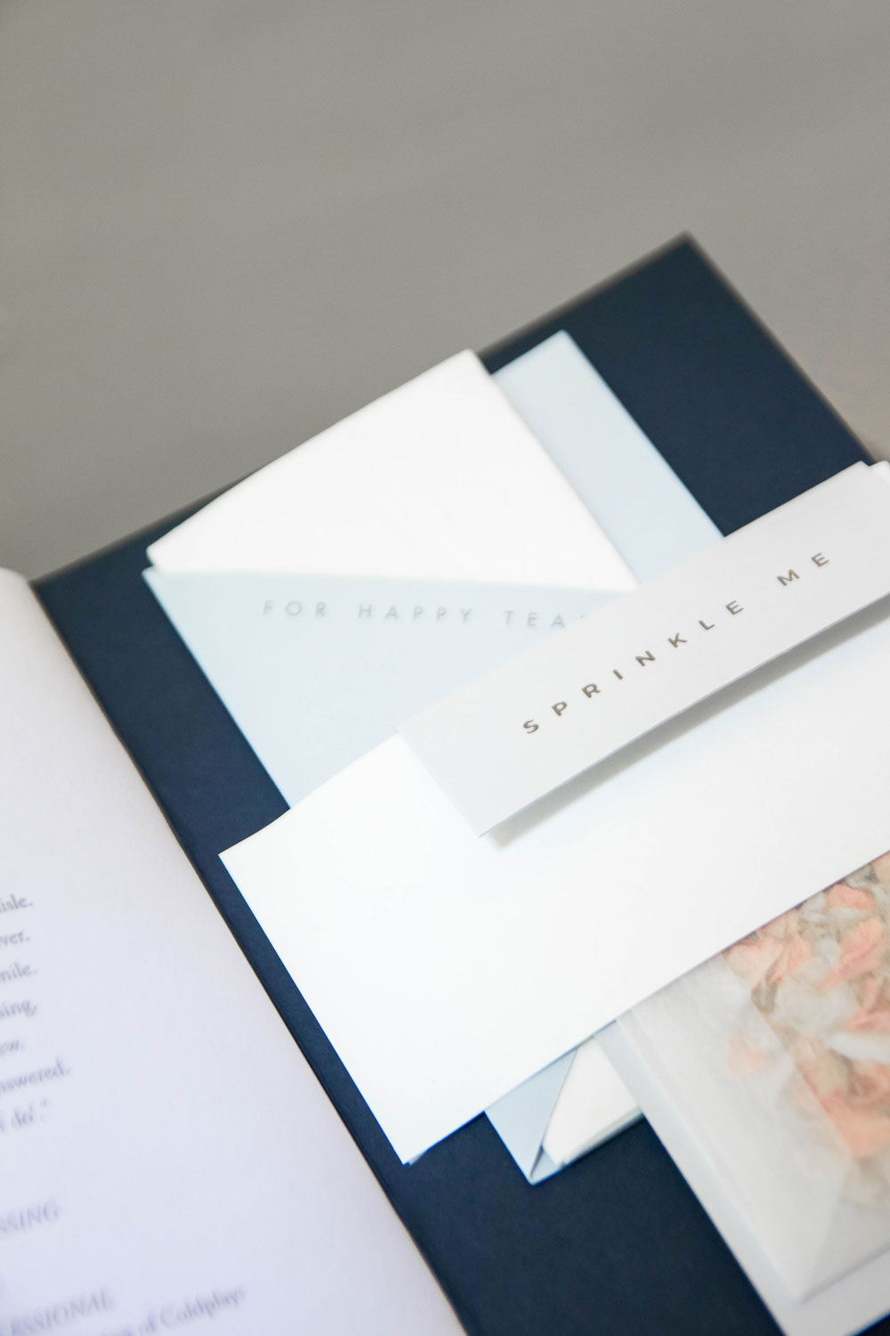
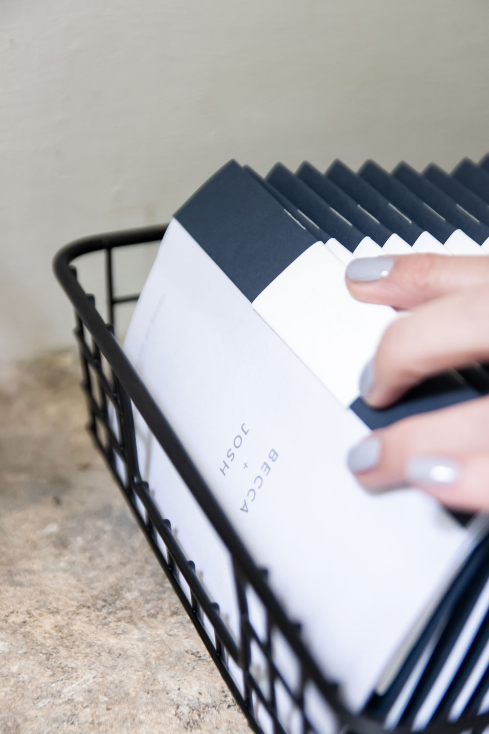
Our Order of Service was effectively a copy of our Details Booklet that we had in the invitations. I’m so pleased that we managed to reuse the design, as I really loved it. Of course Lisa made a few tweaks so that it was appropriate. But it had the same blind embossed wedding date wrap with our date. Although instead of holding the RSVP, Gift and Stay cards, this time it held the confetti and a tissue.
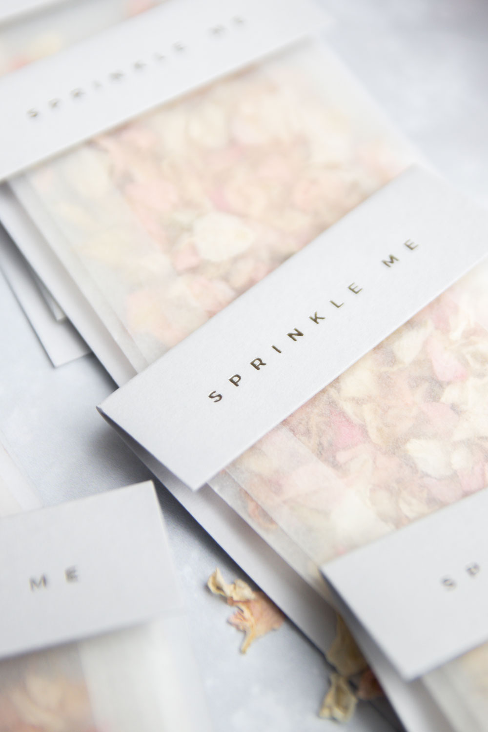
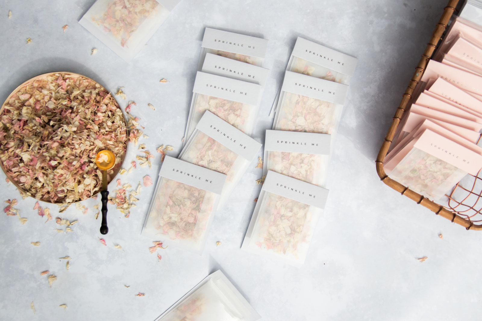
The pages of the booklet were then filled with our actual order of service – you can read all about our ceremony and what it involved here. The luxury confetti bags were initially designed for us. But Lisa loved the design so much she’s now selling them too. So if you love them as much as me, you can purchase them here.
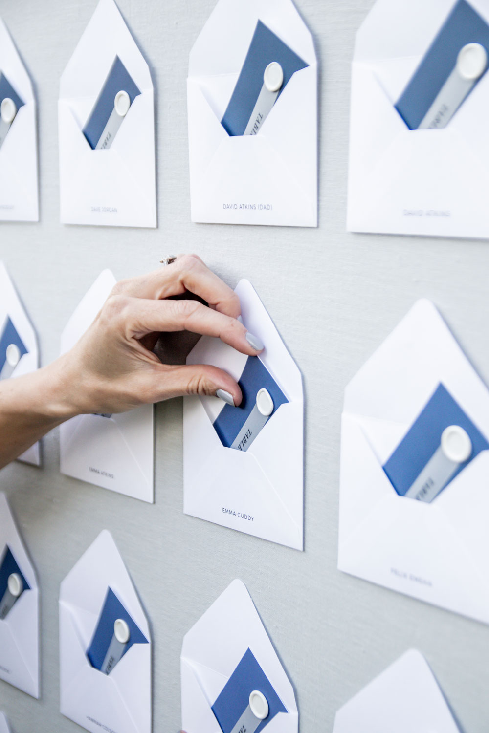
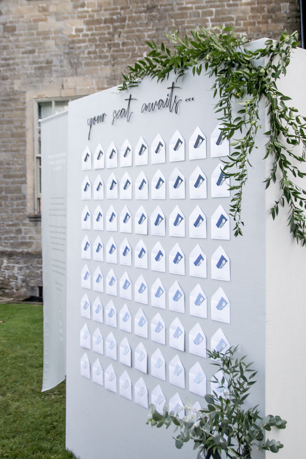
One thing I said to Lisa at the very beginning, is that I wanted our Table Plan to go crazy on Pinterest (I mean it would help if I actually pinned it to Pinterest!!). I just didn’t want it to be like anything I’d ever seen before. So I essentially described what I wanted, and Lisa created something better than I ever could have imagined. With a lot of help from my dad.
Again, I’ve actually already written a post explaining our table plan, so I won’t go into too much detail. Although I will say, it was definitely one of the best things I have ever seen in my life. We continued the ombre theme, and I really do think it was the real wow factor I was hoping for.
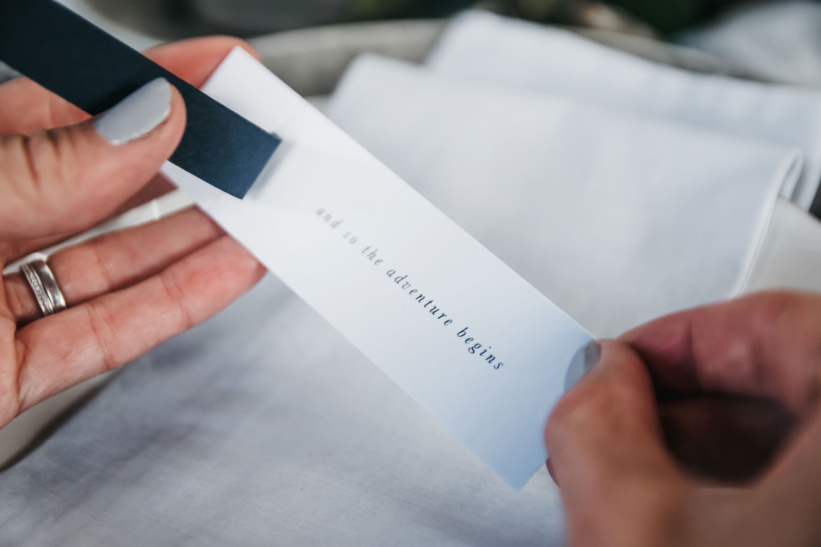
And last but not least with regards to our wedding stationery design – our menu and place cards. We actually had two place cards, one set for the Wednesday night dinner for our close family. And the second for the wedding day itself. The Wednesday night ones were just something simple. However they still had a great design and had the ombre underneath the name with a little note…”And so the adventure begins”.
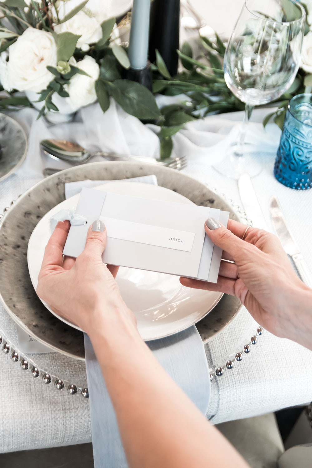
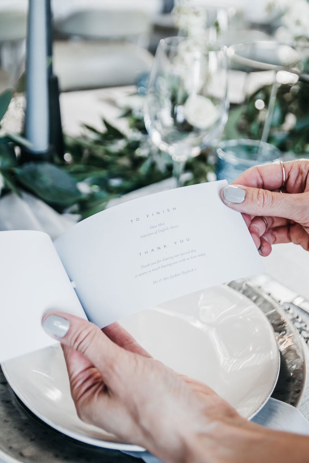
For the actual wedding day, we combined the menu and place name together. And following on from the booklet theme, opened to reveal all of the different courses. I cannot even begin to tell you how happy I was with all of our wedding stationery. I have samples of everything and every now and again, I look back over it all and just smile.
It really was the very best day of our lives. And it was made even better by seeing the stationery Lisa made for us at every turn. And not just bog standard boring stationery. The most amazing wedding day stationery I’ve ever seen.
So Lisa – thank you. For understanding my vision, and bringing it to life, in the most creative way possible. You really are brilliant. So any of those still looking, head her way. She’s FANTASTIC, and you won’t be disappointed.
Images – All Photographs throughout this post were taken by Stories by Chloe. Chloe photographer all of our behind the scenes shots at our wedding. To me the set up is just as important as everything set. So to ensure we captured everything, I hired two photographers to capture very different things.
Disclaimer – We always endeavour to credit the correct and original source of every image that we use. If you think that this credit may be incorrect, then please contact us at info@houseofthree.co.uk
